Style guide
A wee design system's brand assets
Logo #
Let's talk about my name as a brand.
My name is Patricia Montero. Well, it's Patricia Carolina Montero Pachano. I know, it takes ages to say it out loud. So, I've shortened, for I like it when people call me Pati. And also, because of that gorgeous Spanish actress whose name is the same as mine ;)
I use my brand signature as a single word, in lowercase, with a non-breaking space between the name and last name.
There is also the possibility of using only the first name alone or embedded in a circle. This version works better within small or square spaces, as in the case of avatars for social media.
I took the inspiration for my logo from one of my favourite typefaces: Georgia. It's the very same one I use for the paragraphs on my website. Its geeky details—like teardrop terminals and ligatures—are fascinating.
As a personal choice, I removed the serifs on the baseline. That allowed me to smooth out the connection between the characters.
Minimal sizes
The logo must be legible at all times. For print purposes, its characters should measure at least 0.125 inches tall. For screen, they should be at least 16 pixels tall.
Colour palette #
When I chose my colour palette, I kept my values handy, especially openness.
I wanted the contrast to be evident but easy on the eyes. So instead of using pure black against pure white, I'm using off-black (dark) and off-white (light). I also added a warm pink colour in five different shades: lightest-accent, light-accent, accent, dark-accent and darkest-accent.
- #2f2f2f
- #f8f8f8
- #fcdad4
- #fba798
- #f96c53
- #dd2808
- #a71e06
Accessible colour combinations #
These examples meet a colour contrast ratio of 4.5:1, so they conform with the standards of Section 508 for body text. People should be able to read regardless of their abilities or technical situation.
For more information, visit the Accessible colour palette builder.
Typography #
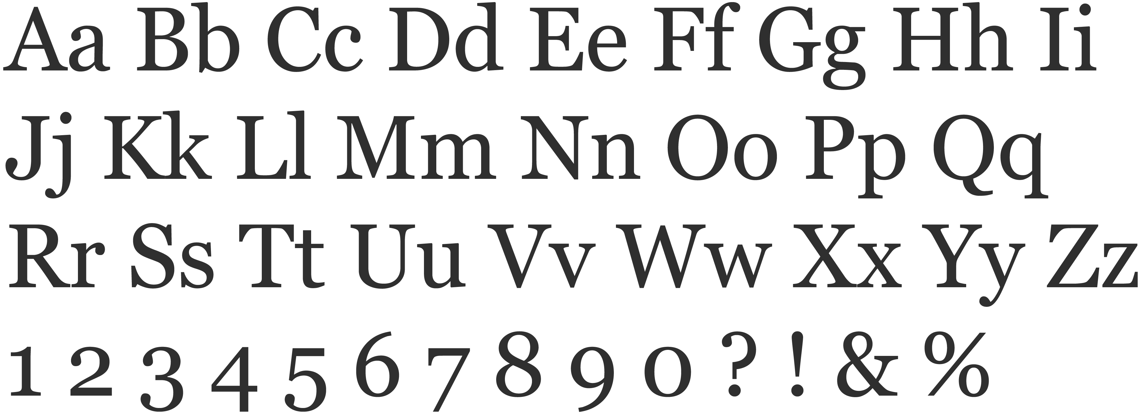
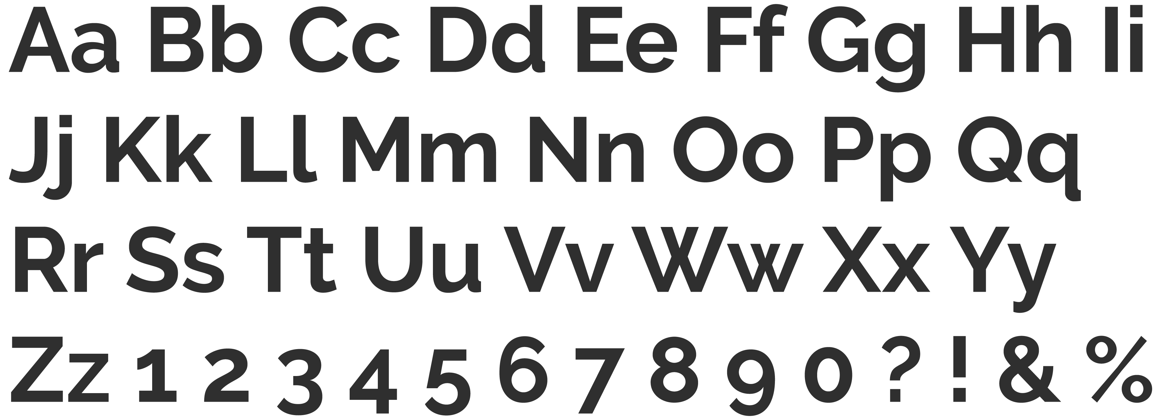
There are two typefaces I use for my brand: Georgia and Raleway. The first one is for paragraphs and the latter, for headlines and buttons.
Georgia #
I chose Georgia thinking on availability, legibility and personality. It's a beautiful web-safe font that Matthew Carter created for reading on screen. I use it for body text, avoiding its application in all-caps or all-lowercase.
Raleway #
Created by Matt McInerney, this sans-serif typeface offers a nice contrast to Georgia. I use to typeset headlines, prominent links and buttons. I also avoid its application in all-caps or all-lowercase.
Type scale #
I use a major second type scale. It starts with a base font size of 16 px (1rem) for a narrow viewport and increases by a ratio of 1.125. Headings have a line-height of 1.2, while paragraphs, 1.6.
To emphasize the main heading, I increased its size by five steps. So I jumped over 1.802, 2.027, 2.281, 2.566, 2.887 to finally adopt 3.247 rem.
Heading one
Raleway 700 – 3.247 rem
Heading two
Raleway 700 – 1.602 rem
Heading three
Raleway 700 – 1.424 rem
Heading four
Raleway 700 – 1.266 rem
Heading five
Raleway 700 – 1.125 rem
Paragraph tagline
Georgia – 1.266 rem
Paragraph intro
Georgia – 1.125 rem
Paragraph body
Georgia – 1 rem
Responsiveness #
As Matej Latin advises for accessible web typography, I set the font size in relative units. For small devices, the base font size is 100%, which in most browsers defaults to 16px. For bigger devices, it grows according to a minimum width of:
- 600 px – 105%
- 900 px – 110%
- 1200 px – 120%
For a comfortable reading, the paragraph's line length also changes accordingly. I strive to keep it close to the optimal range from 45 to 75 characters per line.
These are the main things to consider for this first version of the style guide. Now, for those components and code snippets!
See buttons as a component