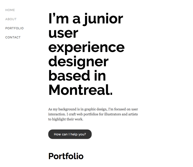
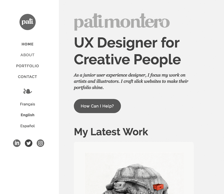
When UX teaches how to design a better portfolio
You know those websites that none visits? Not even with a decent portfolio? Well, I had one of those. I though user-centred design could fix it, and it did!
Wonder how? I followed a four-step process: research, strategy, design and evaluation. Let me walk you through it.
Last update: October 13, 2018 | Reading time: ~8 minutes.
Step 1: Research
My boy taught me that having two buttons for three languages ain't right.
My previous website had problems I thought I knew. But, after a week of research, I realized that I was ignoring the toughest one.
On the one hand, data analysis revealed poor traffic, low engagement and a huge bounce rate. It means that users quit fast after entering a page, as if they were suffering a panic attack in there.
On the other hand, the observation of real users unveiled a non-reachable portfolio. The navigation menu puzzled the testers, and they didn't know what to do during their visit.
Man, I had no idea how confusing my website was.
Why was that?
For starters, I used a template, which wasn't very original. Then, I shoved a whole case study into a popup window. I offered too many things at once. And of course, once I release it, I forgot about it.
But the real dilemma was that users took the thumbnails as my portfolio, missing the work behind. That diminished its whole purpose.
An invisible portfolio makes the website of a creative person meaningless.
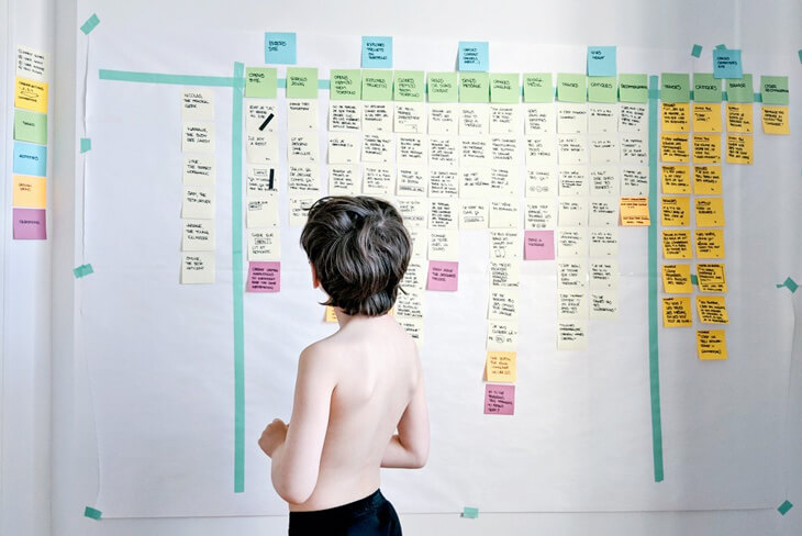
Some sketches, scenarios, storyboards and paper prototype for this website.
Step 2: Strategy
So, I had an invisible portfolio. My website was doomed.
To fix it, I took the problems I saw before and turned them into questions. For instance, How may I develop a visible portfolio? That gave me my goals:
- Develop a visible portfolio.
- Deliver a website with a clear mission.
- Provide a seamless browsing experience.
- Double the traffic.
- Reduce the bounce rate to 70% or less.
- Improve the referencing.
At this point, I knew what to do. Next, I had to know for whom. So, I chose my audience: creative people.
I defined the profile of three personas: a boss, a client and a follower. Developing a website addressed to them will keep my language focused, relevant and simple.
Élise, a boss
“As a director of Marketing, I want to hire a UX designer so that my team can develop user-centred websites.” —Élise
Élise stumbles upon the About page through an online search on a desktop computer. She's looking for a UX designer located in Montreal. First, she scans the content relevant to her and downloads my resume. Then, she moves onto the project pages. Finally, she reaches me by phone.
Normand, a client

“As an illustrator, I want to hire a web designer so that I can promote and sell my work online.” —Normand
Normand arrives at the homepage by typing my URL address on a tablet. One of his friends had recommended me to him to redesign his website. He clicks on the featured project, scans the process and emails me.
Noelia, a follower

“As a graphic design student, I want to learn about UX design so that I can specialize myself in that area.” —Noelia
Noelia comes to a project in progress through social media. She's using her cell phone. She scans the content and explores some external links. Noelia finds this useful and becomes a follower.
Before I started a creative process based on UX design, I sketched for the web with a general goal in mind. Because of this, instead of generating lots of ideas, I iterated the same though once and again.
But my process took a big leap forward when I transformed the pain points into questions. I began to devote a whole ideation session to one issue in particular. It's easier to tackle one problem at a time. Thus, I find myself much more inventive and focused.
Since I'm not planning to keep a blog and as I'm learning to code, my website is quite simple.
Step 3: Design
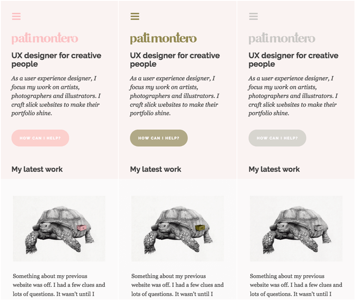
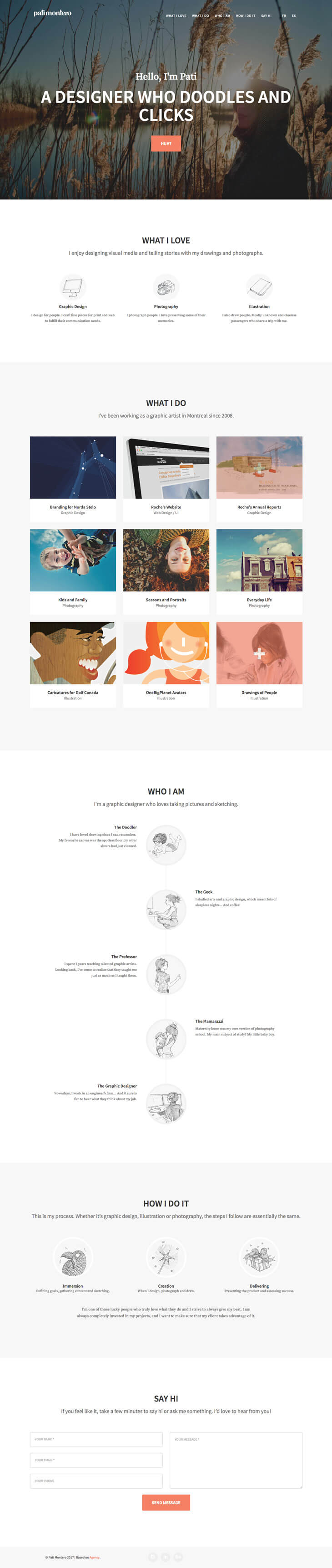
For the new structure and layout of my website, I went back to basics. Its architecture consists of four traditional pages: home, about, portfolio and contact. Their labels in the navigation menu are standard.
I don't want to confuse people anymore. Instead, I hope they focus their attention on the content.
To keep the website light, I chose Georgia, a typeface that is available on every computer. It's beautiful and comfortable to read on a screen. I paired it with Raleway, a Google font. Together, they offer a nice contrast and balance with my content.
Raleway on the titles and Georgia on the paragraphs.
Next, I established a modular scale for my responsive website. I like Zell Liew's proposal: a different scale ratio for each breakpoint. The smaller the screen, the closest the ratio:
- Phone — 15:16
- Tablet — 8:9
- Desktop — 5:6
- Big screen — 4:6
A large-scale ratio (1.414) for a desktop computer. It all looked disproportionated.
A small-scale ratio worked better for the different screen sizes.
When I was happy with the basic interface, I started developing a colour scheme. By following Laura Elizabeth's tutorial, I chose these shades:
The darkest tone is for texts. The accents, for links and buttons. The softer ones are for backgrounds.
The homepage with the colour scheme applied.
I strived to develop an intuitive user interface. So, I followed some design techniques related to the navigation, accessibility and content creation. These are the most essential to mention.
Navigation
- Current page indication. In the main menu, a bold label shows the active page.
- Change of appearance on hover. On a desktop computer, buttons and hyperlinks react when the user hovers.
- Obvious visited links. Buttons and hyperlinks change colour, so users know they already saw the related page.
- Accessible homepage. The logo on the header always takes to the main page, regardless of the device.
“Users spend most of their time on other sites. This means that users prefer your site to work the same way as all the other sites they already know.” —Jakob Nielsen
Accessibility
- Responsive. Mobile-first, the site adapts to four different sizes: phone, tablet, desktop and big screen.
- Deliberate referencing. Relevant use of titles, headings and meta descriptions for each page.
- Prominent clickable zones. Buttons are apparent. Hyperlinks are long enough to click even on the smallest screens.
- Safe contrast. There're dark texts against pale backgrounds. It works even for colorblind users.
Simulation of a reduced sensitivity to red light.
Content
- Good readability. The content's reading level is like the one expected for a fifth-grade student in the US.
- Scannable text. Short phrases, short paragraphs. One idea at a time and the first one is often a summary. Titles give a fair idea of the content.
- Lightness. I optimized all images to reduce the time required to download the website. Also, I disregarded content management systems to keep a cleaner code.
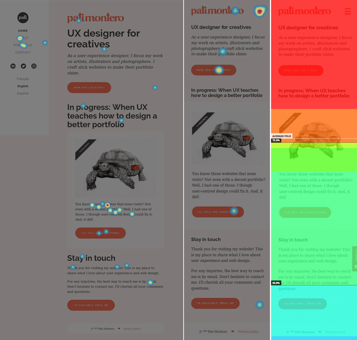
Hotjar's screenshots: clicks and scroll heatmaps of my homepage (desktop and phone). Colours to the right show the percentage of zones seen by the visitors. The red one is the only one that got 100% of views.
Step 4: Evaluation
I have a full-time job, a family to care for and little time on my hands. Plus, my budget to run this evaluation is close to zero. I ought to be creative, instead.
So, I've used different techniques:
Expert evaluation
As Everett N. McKay suggest, I applied a streamline cognitive walkthrough. In a nutshell, it's a step-by-step analysis of your personas' journey while performing tasks on your website. It helps you to fix some issues before testing with real people.
Moderated observation
Since some of my coworkers matched my personas' profiles, I asked them to test my website in front of me. In exchange, I offered them a small service.
That might not be ideal, because they know me and sometimes they were eager to please. But, they did show me things that I couldn't have found on my own.
Unmoderated observation
Here it's when UX gets kind of creepy. There are plenty of tools that allow you to watch real users on your website. It's awesome, but it also gives me willies. These are the ones I like the most, all for free.
- Hotjar records users on your website and then renders screenshots and videos for you. In my case, it showed me the way visitors move through the pages and what are the most crucial areas to consider.
- UsabilityHub offers the possibility of applying five-second tests. It gave me a good idea of the first impression my website makes on people.
- Usability Testing Exchange allows you to invite people to test your website for free. The only thing you need to do is do the same for other members. It helped me to confirm one important issue I need to fix in my new portfolio.
- Validately supplies the tools to build and apply usability tests online. It gave me the easiest and more efficient way to test my website with strangers.
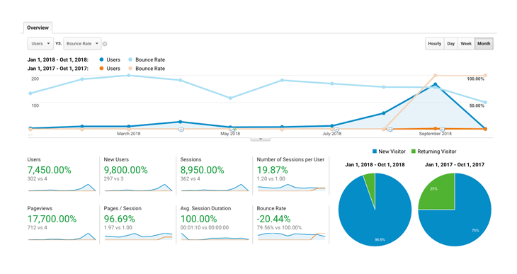
A screenshot of my dashboard on Google Analytics. It shows a comparison between January and October 2017 and 2018. Since I released the new design, the volume of visits improved and the bounce rate decreased substantially.
The moment of truth
I was hoping to say that I achieved all my goals and that my website passed the test with flying colours, but I can't. Here's why:
- Develop a visible portfolio: no. According to the testers, it's quite easy to find my work. But, once they are on a case study, it's hard for some to know where they are. Breadcrumbs, the small link at the top of this page, is not enough. A solution could be adding all projects to the main menu on a secondary level. Still, that may not be practical for a side navigation menu, and this means I need to reconsider the layout. Thus, this is not a successful goal.
- Deliver a website with a clear mission: yes. Users identified the look and feel of my site with design, research and illustration. I'd say this one is successful. Yay!
- Provide a seamless browsing experience: no. Most testers were able to perform the requested tasks. Still, the fact that some of them felt lost in the portfolio pages means that this is not a successful goal.
- Double the traffic: yes. Here is the one goal that exceeded my expectations by far. I know that the amount of effort put into my website in 2017 doesn't compare with what I've done this year. Still, it feels pretty good to see that all the hard work is paying off.
- Reduce the bounce rate to 70% or less: no. Now, I know that I was naive and too optimistic when I set this goal. Though I couldn't go as low as I wanted, a 20% decrease in the bounce rate seems pretty successful to me.
- Improve the referencing: yes. I haven't generated enough value yet to get people to link back to my website. However, Google now has my sitemap, and nowadays my code is more semantic. So, yes, I'd say this too is a successful one.
Now that the evaluation stage is behind me, I know for sure that my website seized half of my goals. I've seen people using it with ease, and that's a meaningful improvement. Still, users get lost when visiting the portfolio. That calls for a significant design review, but that's another story.
Thank you for been here with me. If you found something worth reading, please share it with someone, and I will love you forever. See you soon!
Click on the buttons below for details
About my website
This static website is hosted on GitHub and powered by Netlify.
My secret tools for writing
You should know by now that English is not my first language. If by miracle, you haven't noticed it, it's only because of these cool apps:
Behind the scenes
Some bonus content for geeks like me.
My old website. You can see it here.
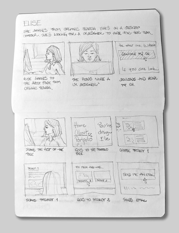
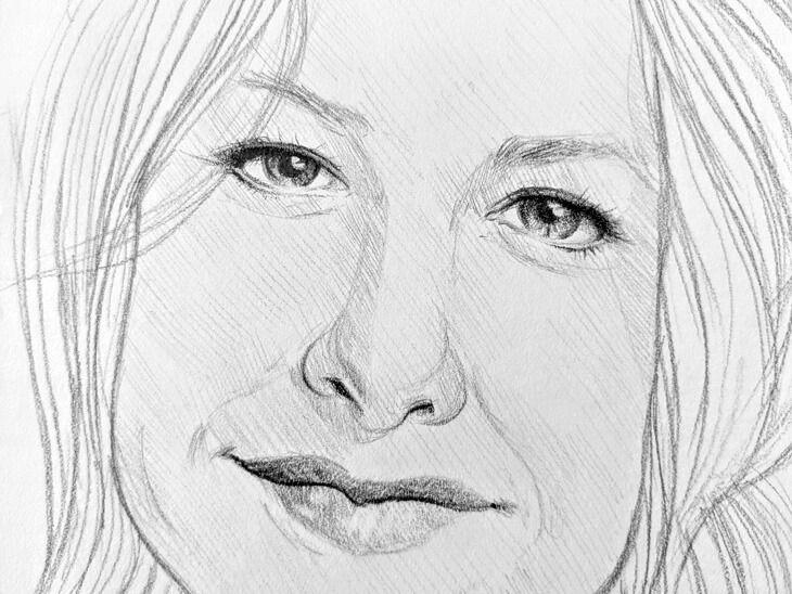
Another storyboard I made for Élise.
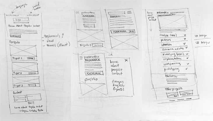
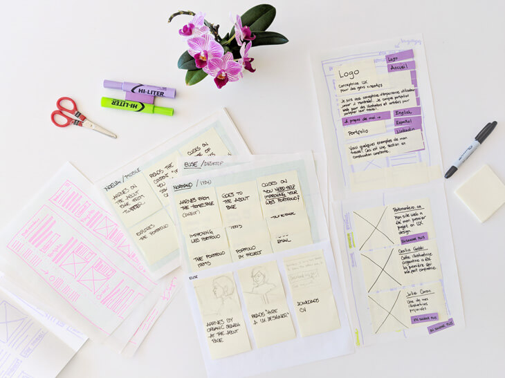
An example of general ideas for the homepage (desktop and mobile) and a project page.
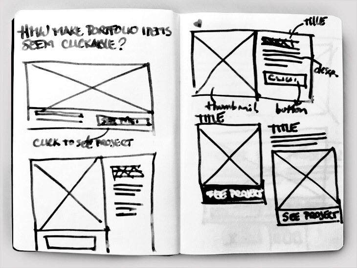
An example of ideas generated from one of my questions. Here, I was studying alternatives to make the portfolio items seem clickable.
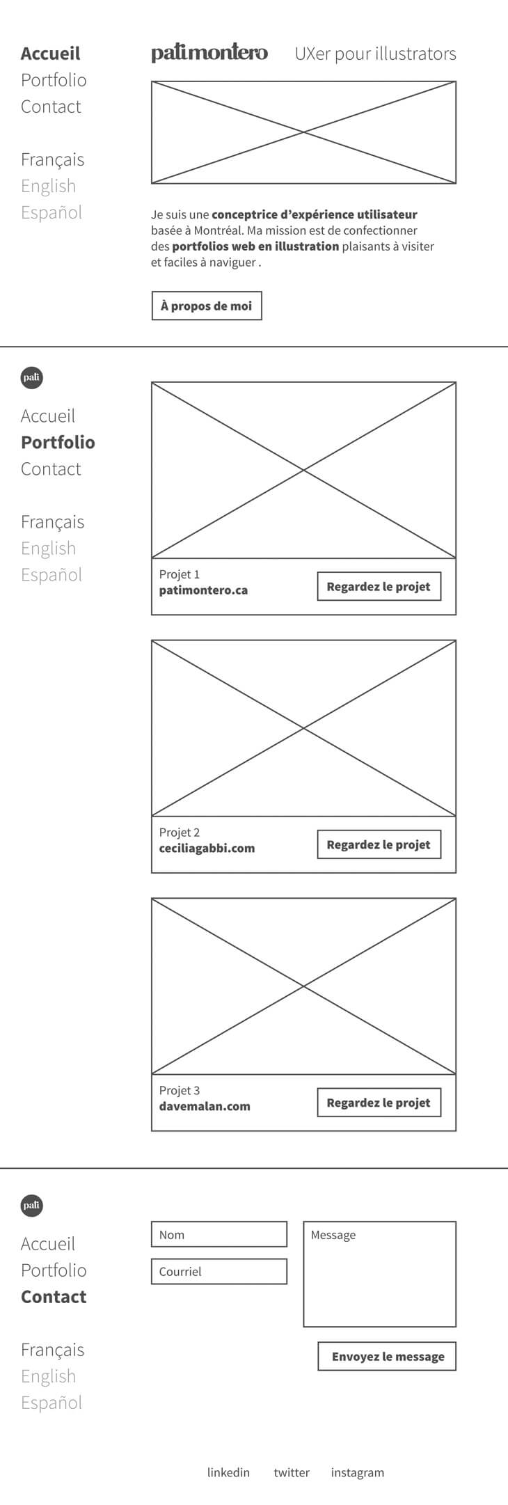
The initial wireframe for my homepage.
On UX/UI design
On design
On typography
On writing
On getting there
© 2018-2020 Pati Montero ❧ Privacy policy